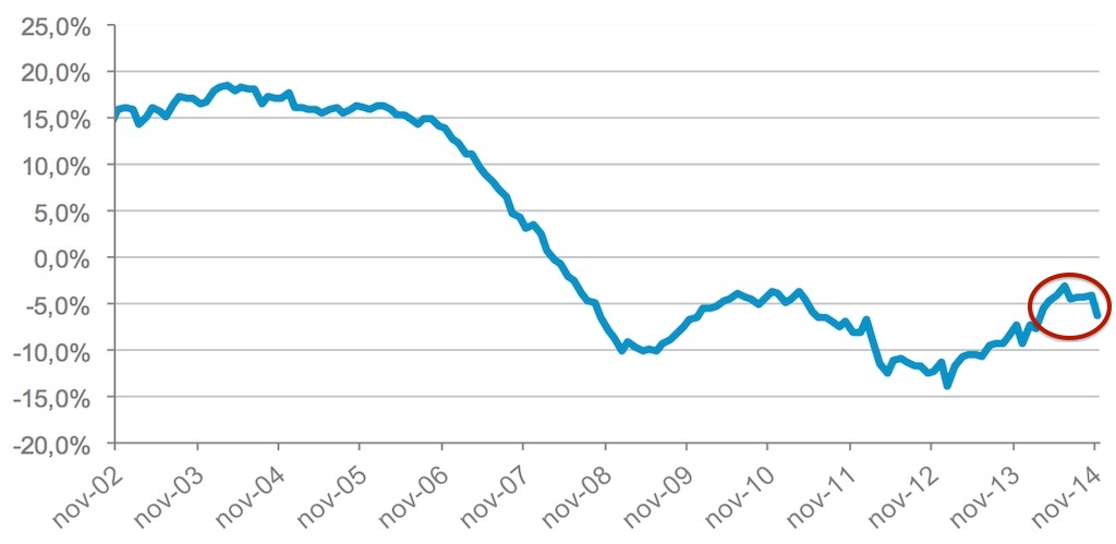
After months trending towards stability the house price index published by Tinsa, an appraisal company, lurched down in November, falling by 6.3 per cent compared to the same month last year (to 1,316).
With this adjustment, the average value of Spanish property according to the Tinsa IMIE General and Large Markets Index is back to where it was in March 2003, after falling a total of 42.2 per cent since 2007.
The year-on-year decrease registered in November more than two points higher than October’s 4.2 per cent decline.
“We’ll have to wait and see what happens over the next few months to find out if this is a short-term phenomenon or if it’s a sign that the economic recovery isn’t leading to an improvement in the purchasing power of potential buyers,” Tinsa explains. “The new types of jobs being created (lower salaries and hours, and more temporary work) may not be enough to boost demand,” the property valuation company warns in its press release.
Despite this, the total 4.9 per cent adjustment in the average price for Spanish property in 2014 is still below the 7.8 per cent registered between January and November 2013.
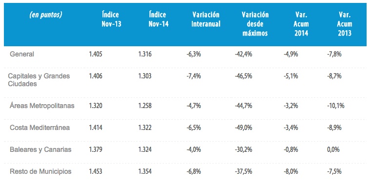
Looking at the index broken down by areas, ‘Capitals and Large Cities’ experienced the largest decrease with a 7.4 per cent drop compared with the same month in 2013. Next came other municipalities, which fell by 6.8 per cent, then the Mediterranean Coast, where prices went down by 6.5 per cent.
The residential market on the islands (Balearics and Canaries) showed the best performance with a year-on-year decrease of 4 per cent. The islands have weathered the crisis best, with peak-to-present falls of 30.2 per cent.
Along with the islands, smaller municipalities are the only two areas with cummulative price falls below 40 per cent. At the other extreme, the Mediterranean Coast has experienced a total fall in prices of 49 per cent, followed by ‘Capitals and Large Cities’ down 46.5 per cent. ‘Metropolitan Areas’ (districts around large cities) are down f44.7 per cent since the peak of the previous property cycle.
John Cook says:
The graph is misleading as it simply shows the decline relative to the same period the previous year. So it is a graph of decline not values which would be much more horrendous.
Juan Miguel. Ay, ay, ay!!
Mark Stücklin says:
As a graph showing annualised declines the graph is not remotely misleading. It shows exactly what it is supposed to show.
Tinsa also refer to the peak-to-present fall of 42pc, mentioned two lines into the article. So it’s easy to work out that a house costing €200,000 at the top of the boom would now cost €116,000, at least according to Tinsa’s national average figures. Perhaps that’s the horrendous figure you want.
GarySFBCN says:
I wonder if the falling ruble has anything to do with this.